As the project requires the titles of the opening of a film, I looked at the different titles of films in general.
I looked at their names and their relevance to the film and how they are presented (font, style, etc..) and showed at the start (or end) of the film.
(1988. dir Tim Burton) The Beetlejuice titles are over back and have a logo styled title which refers to the plot of the film.
Ghouls, ghosts, etc..
Previous research on Beetlejuice
(1986 dir. John Hughes) The title for Ferris Bueller's Day Off is very simple, over black and in bright blue font. The font is styled in a outgoing way compared to a posh or very formal one.
Previous research
(1999 dir. David Fincher) Fight Club uses special effects in it's titles which follows the same formatting as the other titles (actors, director, etc...)
Previous research
(2010 dir. Neil Burger) The title for Limitless appears in a spiral while the rest of the visuals are moving to cause discomfort for the audience because of all the movement. This is because the plot of Limitless is similar to that of disorientation.
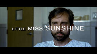
(2006 dir. Jonathan Dayton and Valerie Faris) The Little Miss Sunshine titles are simple. After a short cold opening which introduces the characters of the film, the title appears in a simple font over one of the character's faces.
Previous research
(1960. dir. Alfred Hitchcock)
The titles for Psycho are in black and white because the film is but there are some transitions over the title before it appears. This not only follows a design that the director, Alfred Hitchock, used in a lot of his films, but it connotes to the mystery/thriller genre because it causes the audience confusion.
Previous research
(1994 dir. Quentin Tarantino) The title for Pulp Fiction is very bold, bright and big which shows the title's importance to the film. The colour resemble that of 'orange pulp'. The font resembles the genre of the film which is a comedy, drama, thriller.
Previous research
(1987. Joel Coen)
The title for Raising Arizona is very clever because it is over black but silhouettes the background of a sunset which uses very warming, comforting colours.
Previous research
(1959 dir. Billy Wilder)
The Some Like It Hot titles are in black and white because the film is and they use a very fun font. This shows that the genre of the film is a comedy.
(1991 dir. James Cameron) The titles for Terminator 2 Judgement Day (ignore the title for Linda Hamilton) show the genre because the titles are printed on metal (the metal represents the terminators/robots). The fire below also symbolises that the film could foreshadow deaths and destruction which is in the sci-fi genre.
(2008 dir. Justin Chadwick)
The titles for The Other Boleyn Girl are very simple, over the visuals but with a few lens flares to focus on the title. The title itself uses a very simple font in capitals which shows it's importance.
Previous research
Over black, the titles for True Grit (2010 dir. Ethan and Joel Coen) are simple and yet show the genre. The font is similar to that commonly used a few years back and is similar to that of Westerns because the film is a western.
Previous research
(2006 dir. James McTeigue) The titles for V For Vendetta are over the visuals of the letter V in fire. This represents the film. After a cold opening which introduces Guy Fawkes, the film's title hints to more explosions and destruction. The red symbolises death and love and the capitals for 'VENDETTA' show it's importance.
Previous research


No comments:
Post a Comment